The phenomenon of clicking, since the mouse was invented and demoed for the first time was supposed to make computers easy. Today when I watch computer users surfing the web it is not uncommon to come across users who are 'thinking' with their hand on the mouse. Thinking about what to click next.

This post is that 'click'.
The whole idea of a hyperlink has philosophy elements attached to it. The statement, that on the web, you're just one click away from anything is a rather philosophical concept that the early internet veterans were very excited about. Visit any modern day portals and you'll find this idea bastardized to its limit.
MSN for instance, while I was investigating for this post, was literally over twenty-two-inches long, containing over two hundred hyperlinks (counted through Anchor elements in HTML), each of which appeared to be desperately trying to help you so that you are just a click away from everything MSN had to offer you that day.
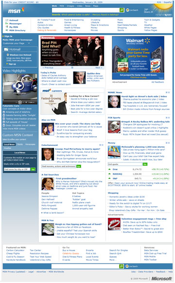
If you want to get an idea of the real scale of the size of the whole MSN front page you can take a look at full blown portal home page screenshot in real size.
Yahoo faces similar problems and so do tons of other portals out there.
Remember the good old days of CD-ROMS where 'interactive' CD's were in and happening? If there was one underlying idea in all successful CD-ROMs, it was this: they were 'interactive'.
You application is supposed to 'interact' with the user. It is not supposed to be a helicopter with complicated levers and switches the user is supposed to pull, turn on or turn off. What the interactive CD-ROMs in those days taught us about usability, is something most modern programmers drooling over technology, and most user interface drooling over pretty looking pictures and user interface elements seem miss out completely now-a-days.
Steve Krug in his book Don't Make Me Think suggests that working with a great web application should be an experience that is as interactive as playing 'Animal, Vegetable, Mineral'; the famous 'Twenty Questions' variant. My personal rationale behind this is fairly straight forward and simple. If you think about all the time that you spend online and the emotions that you experience in that time, chances are that most of your web experience is primarily composed of two types of emotions; or should we say two types of moments.

Put simply these moments can be classified as:
- The Question-Mark moments - when you are thinking about what to click next; usually because you are looking for something and aren't sure where to find it.
- The Exciting Exclamation Mark moments - when you are happy or excited; usually because you found what you were looking for.
The basic premise under which 'Twenty Questions' works is one of on making the journey of finding the answer as interesting as the answer itself. The trick is to make your question-mark moments really short, mindless and effortless. Every question mark moment should be followed by quick confirmations. Every confirmation of being right and being on the right track that you get; should be like a pat on a back; resulting in more excitement moments for you and encouraging you to stay hooked on to the application.
As the philosophers often say - if your journey isn't rewarding; reaching your destination faster just doesn't matter. Twenty Questions takes this premise and turns the journey to the answer into a fun-filled game. Steve in his book, 'Don't Make Me Think' suggests that web designers and web developers should do just that with web applications. Put simply Steve suggests that your web applications experience should be like playing 'Animal, Vegetable, Mineral'.
Deep. Don't you think?
Awesome; now let's do some more soul searching, get philosophical and talk about life and happiness.
On a serious note, besides just appreciating the philosophical aspect of things we're discussing here, let's talk a bit of about how you take a concept which is as abstract as this and turn it into something practical that you can use to make your applications better.
That is what the folks at Google seems to have done when designing the iGoogle portal. What iGoogle does on its home page, for instance, is an amazing example of a portal playing the 'Twenty Questions' host for me. iGoogle doesn't know what I would like to see; so instead of confusing me with switches, levers or a gazillion hyperlinks like MSN, Yahoo and others, it offers me a courteous, polite question on what I would like to see based on my interests.
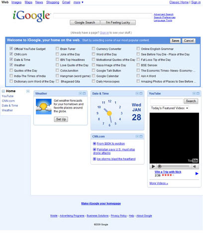
If you were reading and were to take a look at the full blown screen-shot of the image above and compare with the full blown versions of MSN, Yahoo or other portals, chances are high that you will notice what iGoogle is fundamentally doing here.
It's interacting with you by asking you simple a mindless question; from the moment you land of the site.
On a side note, the message of the question itself - 'start by selecting some of our most popular content' - is confusing but the overall intent is pure and polite. The next time you visit iGoogle, it remembers your selection using a cookie and doesn't bother you with the same question again. What's really important here is that iGoogle doesn't worry about how many clicks might have to go in to tell it your interests. In fact, it expects you to start clicking right away; by keeping the clicks mindless.
Put simply, iGoogle is playing the host for 'Twenty Questions' and the game begins with a simple mindless question whose answer you already know based on your interests, the very moment you land on their home page. iGoogle doesn't work hard at reducing your number of clicks. On the other hand it works hard at making your clicks interactive, mindless and enjoyable.
When compared to the driving, while the MSN Home-Page and the Yahoo Home-Page are much like maps of their online city, landing on iGoogle Home Page is like landing on a freeway will really big billboards where it's really easy to find your way around, come back if you are lost and start drive again. You don't even need a map. Steve Krug talks about this analogy in his book Don't Make Me Think. He explains:
|
If You've ever spent time in Los Angeles, you understand that it's not a song lyric - L.A. really is a great big freeway. And because people in L.A. take driving seriously, they have the best street signs I've ever seen. In L.A.,
Now, I'll admin I'm a sucker for this kind of treatment because I come from Boston, where you consider yourself lucky if you can manage to read the street sign while there's still time to make the turn. The result? When I'm driving in L.A., I devote less energy and attention to dealing with where I am and more to traffic, conversation, and listening to 'All Things Considered'. I love driving in L.A. |
While most user interface folks spend sweat and blood in trying to offer you easiest way to get to where you want to go, sometimes, a long enjoyable journey is much more rewarding than just getting from point a to point b. Ever took that slightly longer drive through the freeway just to avoid the city traffic in the shorter route? Thought so.
Just like most modern day drivers aren't deeply worried about saving a little bit of gas, over a generally pleasurable experience and getting there faster; most modern day web users aren't worried about clicking a couple of times more, provided your application is interactive, the clicks don't require thinking and your page loads are blazing fast. In Don't Make Me Think, Steve Krug calls this 'Krug's second law of usability'. He explains:
|
It doesn't matter how many times I have to click, as long as each click is a mindless, unambiguous choice - Krug's second law of usability. On the face of it, "number of clicks to get anywhere" seems like a useful criteria. But over time I've come to think that what really counts is not the number of clicks it takes me to get to what I want (although there are limits), but rather how hard each click is - the amount of thought required and the amount of uncertainty about whether I'm making the right choice. In general, I think it's safe to say that users don't mind a lot of clicks as long as each click is painless and they have continued confidence that they're on the right track. I think the rule of thumb might be something like "three mindless, unambiguous clicks equal one click that requires thought" Of course, there are exceptions. If I'm going to have to drill down through the same parts of a site repeatedly, for instance, or if the pages are going to take a long time to load, then the value of fewer clicks increase. |
While in some cases less is more; when it comes to clicks, lesser number of clicks are not always better. The next time you spend a lot of time worrying about reducing the number of clicks you might actually be spending your time in making the application less interactive and cluttering your screens with elements which requires your users to use their brains instead of their fingers.
May I suggest, dear reader, that we spend our time in making our applications blazing fast by reducing the page load time and focusing on adding interactivity without worrying too much about the number of clicks. When you're cruising through high speed freeway, no sensible driver cares about the trickles of fuel he might have saved had he taken the shorter busy road with congestions. After all, speed still matters.
Is browsing through your application as rewarding as playing 'Twenty Questions'?
Is Your application blazing fast when it comes to page loads and responsiveness?
No matter how hard you try, they'll never be just one click away from everything.
Let's get our priorities straight. Remember, when it comes to user interface, less is more; even today speed matters much more than number of post-backs and when it comes to clicks, three mindless, unambiguous clicks are better than one requiring thought.
If you genuinely worry about your users, worrying about their brains having to work hard is much more important than worrying about their fingers having to work hard. In fact, if you can pull it off well, like iGoogle does, they might even enjoy and appreciate a couple of extra clicks here and there.
The idea of reducing the number of clicks in applications and websites is highly overrated. Unless you hear otherwise from your users; start with the assumption that nobody is counting the number of clicks. Stop hurting their brains and start working on giving them an overall better experience; even if it means adding a couple of extra clicks.
Marking these comments as #EOB.
https://www.thousandtyone.com/blog/AvoidingNeverEndingArgumentsAndFlameWarsByUsingTwitterHashTags.aspx.
Comments are closed.