One of the things I love with this blog is that I can go back, read my older posts and see how my writing has evolved over time. When I wrote my first post on September of 2006 after working on a fix for DasBlog that would let me run it on a cheap hosting account (with medium trust settings on IIS), I wrote for an audience. Within a couple of months I understood that I was not going to have an audience. It's funny how everyone realizes that after he starts blogging. That's when most of them quit. Others who absolutely love writing, even if they have to write for a very small audience, continue.
Then somewhere, after a couple of months, people started coming to this website in small trickles. That was around the same time where I had gotten used to the idea that I was going to blog for three people, You, My mom (who still reads everything I write) and me myself. Even though my writing was morphing into casual writing, I was sprinkling my posts with an overdose of "Dear Reader" all over my posts. Something for which I was heavily criticized.
The look and feel of the blog and the font was also a reflection of my writing style. The font's of the blog were carefully designed to look beautiful and professional. Verdana is supposed to be one of the most readable fonts out there. It's not esthetically beautiful however. So I decided to go ahead with a 9.5 to 10pt Tahoma (which is nothing but a slightly compressed, skinny and better looking version of Verdana, though not as readable). The idea was that if my blog looks beautiful, you might stick around and read stuff.
The entire blog ran on a DIV based design, because Graphic designers around the world told me that if you cannot do a DIV based design YOU SUCK. Yeah, Right. So I landed up with a DIV based design with strange CSS positioning which made the blog look slightly different on Internet Explorer and Firefox. That is a whole different post there, but the point I am trying to make here is that everything about this blog, was planned to be 'technically correct'.
But what is 'technically correct' Isn't always the most pragmatic thing to do. Of course the blog has to look beautiful. Of course it has to have a single consistent font across the website and of course the design has to be DIV based, but then when a few more people start showing up and someone leaves a comment telling you that he wants to print your stuff on a printer and your DIV based design is chopping stuff off in his printer, 'technically correct' is no longer the right thing to do.
This weekend a couple additional funny things happened which nudged me to go out there and make some changes to the design of this blog. This weekend, I had some time so I started writing. The topic that I picked however, was how most managers love the idea of pushing their team to make them work harder and what they can learn from parenting. Because this topic happens to be near and dear to my heart, it turned out to be one of the longest posts that I have ever written till date on this blog.
When I had prettied it up, proof read it and published it, I started reading it. That's when I realized how everything that was so carefully designed to be 'technically correct', was so utterly wrong. I was starting to feel sorry for anyone who was reading this blog in-spite the 9.5pt Tahoma which was just making it impossible to read anything more than barely midsized post.
I decided to go hunting for fonts. And after a lot of reading, hunting, trying out stuff (and soul searching) I've landed with Georgia as the default font for the post text. Here's why:
- Georgia is sexy! I love the look of it.
- Georgia is fun to read. I actually ended up reading the entire blog post on the slap and push technique to management on both internet explorer and Firefox and no it did not cause me a headache.
- Georgia is preinstalled in both Windows and Mac machines. Which is where most of my traffic is based out of. If you are running Linux and do not have Georgia preinstalled, I highly recommend you get your version of Georgia from here.
Besides Georgia as a font does not break or look hideous when I blow it up to a size of 12pt to make my posts easy on the eyes of the readers who are actually going to read it. In fact it looks just as beautiful at a 12pt size which is what you are reading at right now. Oh and yes, did I tell you the italics on Georgia look beautiful and get the point across. Not like the italics of Tahoma which... suck.
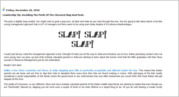
Just in case you were wondering about how the end result is different, here is the before and after images on a paragraph on the older blog post for you to compare side by side. It's a scaled down, low resolution image but even with these images you should be able to make out the difference between overall readability.
The old font:
The new font:
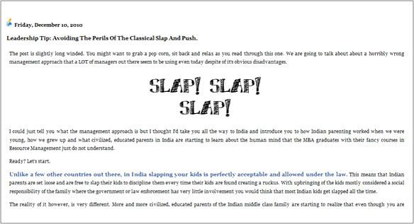
I don't know about you, but I would pick the new design any day.
With the text of the posts changed to Gerogia, it was time to think about the left navigation. I picked Verdana there, primarily because I wanted you to focus on the content text than on the left navigation. If you need to look for a link however, Verdana, being one of the most readable fonts out there helps you spot stuff easily.
The idea was to tune the blog for the small audience that is logging in everyday and reading stuff and not for the casual lurker who lands on the site through Google and decides if he is going to stick around depending on how the site looks.
With the font and the font size settled, I set out in search of a good "line-height" that I should be using to be easy on the serious readers eyes. Looks like most BlogSpot out of the box themes are pretty generous about the line height. I settled somewhere in the sweet spot between 170% and 190%. What this means is that you are probably seeing enough vertical space between two lines so that you do not have to strain them or move your face closer to the monitor to read stuff even in really high resolutions.
I have been reading some of posts after these design changes and I feel that some one these changes are actually nicer to my eyes. Oh and while I was at it, I moved back from a DIV based design to a table based design. It's much easier to control and It seems to be giving me a consistent look across browsers. Besides a table based design makes it really easy for me to spread out my design in percentages and utilize maximum real estate on the page. I know its not the best approach to designing a website but it is way better than having to maintain different CSS files for each browser. After all, the technically correct answer is not always the right answer.
Put simply, I've broken every single thing on this blog that was supposed to make it look good and what we have here is a blog that is much nicer to your eyes. Given the choice between looks and readability, I would pick readability any day. If there is a way to have them both, I would love to. If you have a few tips or suggestions on how the design can be improved, drop me an email or use the comments section below.
Oh... and... sorry for hurting your eyes all these years and thanks for continuing to read. #Grins.
Comments are closed.