Ben Hunt has written an Excellent book on Web Designing; but when it comes to his own blog / web-site, Ben is guilty of breaking rule number three of Thirteen Blog Clichés . Jeff Atwood describes:
|
When I find well-written articles on blogs that I want to cite, I take great pains to get the author's name right in my citation. If you've written something worth reading on the Internet, you've joined a rare club indeed, and you deserve proper attribution. It's the least I can do. That's assuming I can find your name. |
Go ahead click the link to the online version of Ben's book which is a freely available on his web-site. There are ads of other books that Ben has written on the page but when you try to find the author's name for the book that you are reading - zip! nothing!
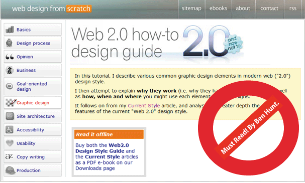
I landed on this page through a Google Search Query and while reading the Web 2.0 design guide I had a hard time finding out that Ben was actually the author of this excellent book which imparts words of wisdom to web developers and web designers around the world on how to build effective web designs.
It was only when I navigated back to the primary domain (web-design-for-scratch) that I found out that Ben owned the entire site and that the book belonged to him. Ben Hunt, in spite of being an amazing web designer, a great writer and a web guru, is guilty of making me think and that, according to Steve Krug, is an offence. Take that, Ben! :)
Jokes apart, for me Ben's book is as good as Don't-Make-Me-Think when it comes to building web-sites; and what' makes this book even better is that it's available online for free.
You there. You, yes you. If you're a web designer or a web developer building web applications you need to stop whatever it is that you're doing and read this book. Now! No, I don't care if you are busy; I don't care if have a lot of work to do; I don't care how many other usability and web design books you've read; go tell your boss you won't be doing anything for the next one day and read this book word by word.
Seriously, Read the book; chances are, you'll probably take home more than one idea on web design that you always believed in but couldn't quite pin down.
The book highlights a lot of concepts on Web Designing but to me the concept that stands out the most can be summed up in one word:
Simplicity.
Just like simplicity in coding, building features, design and development, simplicity in web design also has it's own ability to stand out and distinguish itself from the crowd; in an elegant subtle way. When choosing between attractive-and-complex vs. simple-and-elegant I would prefer simplicity blended with elegance any day. After all, Simplicity Rocks!
"That's a great design! You've really proved that you're great at Photoshop and other designing tools. Now dump it and start fresh." - I often see myself giving this advice to web developers and graphic specialists around the world. Specially the ones who tend to use a lot of jazzy bells and whistles, beautiful smiling faces and rich color combinations in their web applications.
Don't get me wrong. I have nothing against a lot of jazzy bells and whistles, rich graphics and beautiful smiling faces on a web-sites. If your application, web-site or the point you're trying to convey to the world / your customers / your visitors demands that, by all means, go ahead and use all of these. If not, I don't see the point of having an elegant design that's much more attractive than the point you are trying to get across.
In Ben's word:
|
Whatever you're saying, choose wisely where you use your ink/pixels. Use it to communicate, first and foremost. Then, ask whether you can communicate just as effectively with less. If so, do it. |
Here are some web-sites that I've often cited as examples:
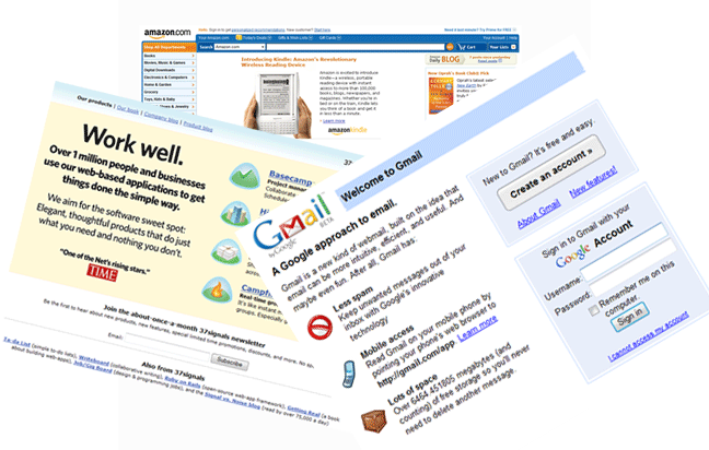
None of them are rich when you consider them from a graphics perspective. Ever wondered why? Is it because these organizations cannot afford a couple of kick-ass web designers who know how to get a lot of jazzy images and bevels done?
Ben's book uses words from Antoine de Saint-Exupéry, the classic author who wrote soul stirring books like The Little Prince, to illustrate the point:
|
"It seems that perfection is reached not when there is nothing left to add, but when there is nothing left to take away." - Antoine de Saint-Exupéry, Terre des hommes, 1939. |
I think these words sum up exactly what I mean by "You've really proved that you're great at Photoshop and other designing tools. Now dump it and start fresh." much more articulately than I could have ever said it.
Early on in my career, on my way to office each day, I would pass a bill-board sign of a cellular service provider. The billboard hoarding had a very wise slogan - 'you don't always have to be loud to be heard' - as strange as it may seem the board had a lot of impact on my life.
With web site design, I think the most effective sites are the ones where the designers are not trying to 'prove' anything to anyone or becoming loud to be heard. The most effective web-sites today, are sites where the web designers are making bigger points and conveying bigger and better ideas with lesser pixels - using a calm, subtle, non-intimidating and helping tone.
Dear readers, fellow Web Developers and Designers, for today I leave you with one thought to harp on and one assignment to execute.
Thought: Software is composed of technology, underlying platforms and above all end users and how they perceive and experience the application. If your User Interface doesn't gel with the world and ecosystem around it, it's useless.
If your user interface doesn't get to the heart of the problem you're trying to solve with your application or convey the point you're trying to make with your web-site, by showing up blazing fast and then guiding the user with a simple non-intimidating and simplistic tone, particularly without overwhelming or distracting them, you may have come up with a really beautiful design and proved that you're an expert when it comes to Photoshop, Illustrator and tons of other design tools but in the end it doesn't matter!
If your excess pixels end up taking too much time to load or end up innocently confusing your users by pulling their attraction on just the bells and whistles instead of the core functionality, you have missed the whole point and failed completely!
Yes, you have a beautiful User Interface, but is that really the point? Is that the only thing defining your success as a web developer or web designer?
As for the assignment, go read the really invaluable and free advice on making your Web User Interfaces better directly from the expert's mouth. Quick! :)
Comments are closed.