(Left Justification Vs. Justify Alignment & Facts About Text Justification Every Programmer And Designer Should Know)
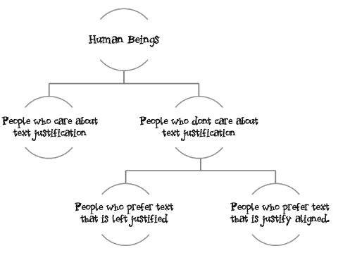
When you look at the world from the eyes of programmer who cares about text alignment on the web, his own documents, his website and his applications, the whole of the human species can be broken down into these groups:
And If you don't care about your text-alignment all I can tell you is that you should. The basics are fairly straight forward and knowing them can make your output (blog posts, applications, web sites and articles) that much more sexier. How you align your text on your web pages and your blog has a bigger impact on your readers than you can think. So close your IDE's for sometime and invest just a small part of a couple of your days in reading a few posts on how text alignment works. This one is on using justified alignment in your articles, blog posts, applications and websites.
The idea for this post started when I sat down to revamp the design of this blog and was faced with a Hamlet like question that just held me by my collar and would not let go. The question was on this line:
To justify align or not; that is the question.
Turns out; that most information you can find on forums where this question has been asked is subjective. Someone comes in and says, "Yeah! You should justify everything. It's sooo freaking cool!" and then someone else responds with, "No Dude! Justification sucks!". There is very little objective data available out there and the information that is out there is spread across umpteen number of disconnected information sources like Wikipedia, hidden research papers and cryptic paid articles.
The attempt here is to give you the basics about justification of text using one consolidated post so that you can state researches, experiments, facts and sources in meetings which are organized to decide if you should left align your text or justify align it and then you can end up sounding like a genius or a rock star or an alpha geek or a design guru! Well, not exactly, but then you can still use this information to improve your website, application, blog or other documents.
So read on.
Ready? Let's start with the basics first. The Kids Stuff. The stuff everyone knows and then we can build on that. So let's assume you are one of those guys (or girls) who doesn't give a rat's ass about justification and you don't even know that the two basic kinds of justifications that you can have are Left Justification and Justified Align. Here are their examples:
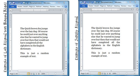
The left justification is also called the "Ragged Right" because the right end of each line doesn't align with the line above and under it. Put simply the right margin (where the lines end) is ragged. On the other hand if you look at the justified text example above the left and the right margins are perfect aligned. In documents or paragraphs that are justified aligned each line begins and ends at the exact same spot on the horizontal axis.
Designers dig justification because justification makes your articles look professional. Justification has had an aesthetic appeal to it and has been used in professional newspapers and magazines for years.
This is stuff you probably already know.
The process of justification looks fairly simple on the surface of it but if you scratch the surface and move a little deeper there are quiet a few moving parts which give it the sex appeal it has in the publishing world. Justification mostly plays with spacing between words and between characters to align both margins.
You could spend hours studying Wikipedia links on the topic to see how it works or we can just do a quick typography 101 course right here to cover the basic concepts we need to move forward.
I am going to assume that you're a lazy dude who wants too be spoon fed in simple English so instead of linking to ten lengthy Wikipedia articles on typography we're going to do a quick Typography 101 digression right here and talk about the basic stuff that you need to know about typography in the context of text alignment. Then we will start talking about the intricacies of text justification. So; on to a quick typography 101 course.
Digital Typography 101 and the Stuff You Need To Understand Before Moving Ahead.
The world of digital typography primarily contains two kinds of fonts. Mono-space fonts and Proportional fonts. The Wikipedia article on the topic is here but the basic premise, in the context of justification, is that mono-spaced fonts give the same amount of space to each character in the font where else proportional fonts give each character in the font just the space it needs and no more. Here's a picture from Wikipedia that explains the concept:
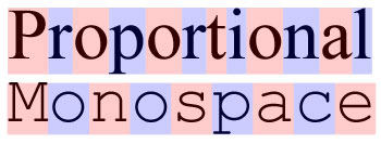
See how the pink and blue boxes (which represent space each character takes) are of the same size in case of Mono-spaced character but their sizes vary in case of proportional characters? That's the basic difference between these two font types. Now a days, unless you're coding on your IDE or using the terminal window chances are that you are using proportional fonts because they just tend to look sexier than mono-space fonts and everyone seems to be moving over to proportional fonts. Proportional fonts and Mono-space fonts are the first piece of the puzzle that you need to understand in order to appreciate how the justification process truly works. Serif fonts and Sans Serif fonts are the other piece so let's talk about those.
The world of digital typography also has two basic kinds of fonts that you need to know about. The serifs and the sans serifs. Serifs are tiny strokes that you give to the loose ends of each letter to make them look sexier.
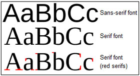
As you can see from the picture that I borrowed from Wikipedia, Serif fonts have these strokes which are shown in Red, Sans Serifs do not have these strokes. An easy way to remember this is the fact that "Sans" in French means "without" so Sans Serifs practically means without the serifs or without those sexy strokes at the end of each letter.
Back To Justification
Ok, so it's time to end that long typography 101 digression and get back to justification. Now that you are a little smarter and you know what monospaced and proportional fonts are and what Serifs are and what Sans Serif fonts are lets go deeper into some of the tricks that are used to increase the spacing between words and characters to get evenly aligned margins in justified documents.
Tracking And Kerning Algorithms
In justified text the application that gives you the justification feature needs to align the left and the right margins. In order to do that in some cases the application needs to increase the space between words and characters of a line to make the lines look broader than they already are and in some cases it needs to squeeze the spaces between the words and the characters to make the lines narrower than what they would be otherwise. The lines which are stretched to occupy more space than they would normally occupy are called loose lines and the lines which are squeezed to occupy less space than they would normally occupy are called tight lines.
Two techniques that the justification process uses heavily to create these loose lines and tight lines in order to align the margins are Tracking and Kerning. Tracking involves adding even volume of space between each character of a word to create a loose word or to create a loose line. Because Tracking only involves adding equal space between words it works on both Mono-spaced and Proportional fonts.
Kerning on the other hand increases and decreases space between proportional fonts based on multiple factors. This picture (again, from Wikipedia) illustrates the difference between Kerning and Tracking.
![]()
Kerning works on proportional fonts and it also uses a host of factors like whether a font has Serifs or not to bring the fonts closer to each other. Here's another picture from Wikipedia that explains this concept:
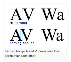
Notice how the serif's are brought over each other to decrease the spacing between two letters in the above picture. Of course you cannot have kerning on mono-spaced fonts because each charter has a fixed space it occupies. You can increase the space between words by adding extra empty characters (i.e. tracking) but with mono spaced you cannot do things like move a character juuuust a little bit to the left to align it's serif with it's previous fonts. Because mono spaced fonts give exactly the equal amount of space to each character funky arrangements of letters like that to make the overall output look sexier is just not allowed. That's why kerning only works on proportional fonts.
You can read the entire article on kerning but the point in this context, is that most browsers and word processors use their auto kerning algorithms to increase or reduce spaces between proportional fonts when you turn the justification of a paragraph to on. And justification in one word processor or browser may not be exactly same as justification in another word processor.
Ken Adams for example is a firm believer that the kerning algorithms of Microsoft Word suck and that you should never use justify align in Microsoft Word documents.
Long story short, the look of your justified text is going to be just as effective as the tracking and kerning algorithms of word processor, the browser or the reader where the user is going to read the content. That of course is the beginning of all the problems associated with justified text. Justification can create another problem which is often made worse by bad kerning and tracking implementations. The problem is spaces which align and stack right over each other. This problem is called "Rivers" by typographers.
Rivers
Another issue that digital Kerning and Tracking often produce is the problem of Rivers. When you increase space between all the words to align both sides of the margins the spaces in the middle of the words can often tend to align creating long stretches of white areas which make it difficult to read the entire paragraph. These white stretches are what are called Rivers in typography.
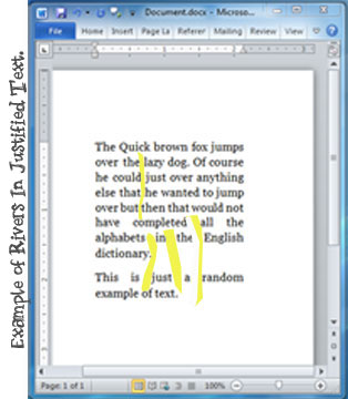
The above diagram shows some rivers in a word document with just a couple of paragraphs that I used earlier in the post to illustrate the difference between left aligned and justified aligned text. The rivers are marked in yellow. They get much worse when you are doing complex documents. Rivers makes reading documents and content that much harder especially for people with dyslexia. Rivers can be avoided by a typographic technique called Hyphenation.
Color And Hyphenators
The fundamental reason why most people are tempted to use the justification setting in their word processor when writing documents or in their CSS when blogging or writing HTML pages is because they have been seen books and magazines that have been justified. The tight look and the amazing visual appeal of justification in these books and magazines makes developers and budding designers believe that justification looks good just by it's inherent nature.
What people often forget is that most typographers who are responsible for publishing magazines and books don't just give attention to outline of the rectangle space which holds the content but they also pay a great deal of attention to the fonts and the evenness of space within the rectangle. In the world of typography this is called the color. Typographers go to great lengths to maintain the color of the document. One of the tricks they commonly use is referred to as Hyphenation. In fact H&J (Hyphenation and Justification) is the technique used while type setting most books and magazines.
In his excellent article on the topic of Justification and Hyphenation Richard Fink describes the process of hyphenation using the example below:
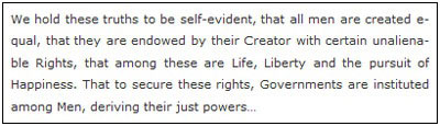
Notice how the lines in the above paragraph could have been too tight or too loose to create rivers and how words have been broken up using hyphenation to avoid the problem.
Hyphenation is good when it is used in the print media but in most word processors and browsers hyphenation tends to have it's own set of problems. Most latest browsers out there support soft hyphenation. With soft hyphenation you give the browser a permission to insert a hyphen if the kerning, the size of the page, the content and the layout is going to result in lines which are too loose or too tight. Put simply, the browse has the permission to break a word with hyphens if the situation demands that the hyphenation be inserted.
The way to hard code this is using "" HTML tag or using "" HTML tag in the right place. So if you wanted to allow the browser to break the word "equal" after "e" you would write it as "equal".
Of course anticipating and hard coding every word for hyphenation is not the most practical of solutions so folks have been coming out word press plug-ins and Java-Script libraries for auto inserting the hyphens.
When you automatically insert hyphens to align your margins and to maintain high typographic color in the page you start running into issues pertaining to copy / paste. The hyphens (even soft ones) have their Unicode characters and when you copy content from a website that uses auto hyphenation script chances are that you might end up copying the hyphens along with the content. Similarly when you are searching for words which have been auto hyphenated you are left on your browser's ability to understand the soft hyphens and ignore them during the searches.
Richard's article on the topic is an excellent resource on Hyphenators and the hyphenation tools and scripts that are out there. If you haven't clicked the link already, you should. Once there spend some time there understanding hyphenation.
Richard highlights some of the annoyances with hyphenators and ends his article on an optimistic note:
The solutions to these annoyances lie squarely with browser makers. High-res displays like the iPhone Retina, convenient e-reading devices like the iPad, and web fonts have brought a new focus on web typography. Hyphenation and justification is an important and time honored technique. Hopefully the information here will help make it an option for onscreen reading sooner, rather than later.
These tragic reality of life right now is that that even though H&J (Hyphenate and Justify) is a time tested technique in the publishing world, most devices and browsers are yet to fully catch up with seamless automatic hyphenation support.
The basic esthetic appeal of justification attracts many designers and web content writers to it, but given the current set of problems is the esthetic aspect of justification even worth chasing? This question was answers by a set of very interesting surveys.
How The Human Mind Perceives Justified Text
Based on most research that has been conducted so far, even though justified text does have esthetic value it is not the most reader friendly alignments out there. The British Journal of Visual Impairment (PDF link) (Accessibility assistance for visually-impaired people in digital texts) covers a list of surveys which provide more specifics:
Harrison was unconvinced that larger spaces between letters, words and lines increased legibility (Harrison, 1980, cited in Davies, 1989). However, according to Gaster and Clark (1995), increased leading, or white space between lines of type, makes a document more readable for people with low vision. According to Arditi (1999a), spacing between lines of text should be at least 25 to 30 per cent of the point size. This is because many people with partial sight have difficulty finding the beginning of the next line while reading.
Additionally, letters that are too close together are difficult for partially-sighted readers (Gaster and Clark, 1995), especially those with central visual field defects. Spacing needs to be wide between both letters and words (Arditi, 1999a; Gaster and Clark, 1995). Harrison thought that the most important
factor for children’s books was the unjustified line (i.e. the printer has not varied the space between the words to produce a straight margin down the righthand side of the page) (Harrison, 1980, cited in Davies, 1989). Unjustified text may be easier for poorer readers to understand because the uneven eye movements created in justified text can interrupt reading (Muncer et al., 1986).
David R. Thompson, a PHD student at the University of Texas at Austin and the president of SENSS Publications and Seminars, Inc, conducted another survey with 40 undergraduate students where these students read 12 text samples from randomized reading tests. The tests involved different simulations of magazine pages in four column formats. One of the conditions in the survey was the comparison between flush left and ragged right justifications. David describes the results on his tests in his paper (PDF Link):
In a justified (even left and right margins) format, the eye "knows" through repetition, how far it must travel to perceive a line of print. Thus, the justified format may minimize pauses in eye motion following backward eye movements, regressions, within a line of print (Bayle, 1942; Rayner & Pollatsek, 1989). This suggests that the longer the look, the longer the processing time (McConkie 1989).
By extension, flush left / ragged right margins may force the reader to process each line's end point and re-evaluate the distance of each sweep (Rayner & Pollatsek, 1989). These assessment strategies may require "extra" time to process information presented with flush left / ragged right margins (Glass & Holyoak, 1986).
The Graphic elements Model predicts that an increase in the amount of mental effort required for visual and spatial analysis of textual cues will result in enhanced memory for information derived from that input.
This by all means is an interesting result. Even if you were able to avoid all the inherent problems of justification, like issues with kerning algorithms and the river effect, justification might give faster reading speed on text but then you might end up with lower recall of the content. Put very simply your readers might be able to glance through your content very quickly but they might end up remembering less of your content than they would if it had a ragged right margin.
The "Improving Validity of Large-scale Tests: Universal Design and Student Performance" report by National Center on Educational Outcomes sums some of the above and a whole lot of other researches that have been done in this area. The observations are simple:
Staggered right margins are easier to see and scan than uniform or block style right justified margins (Arditi, 1999; Grise et al., 1982; Menlove & Hammond, 1998).
Justified text is more difficult to read than unjustified text – especially for poor readers (Gregory & Poulton, 1970; Zachrisson, 1965).
Justified text is also more disruptive for good readers (Muncer, Gorman, Gorman, & Bibel, 1986).
A flush left/ragged right margin is the most effective format for text memory. (Thompson, 1991).
Unjustified text may be easier for poorer readers to understand because the uneven eye movements created in justified text can interrupt reading (Gregory & Poulton, 1970; Hartley, 1985; Muncer, Gorman, Gorman, & Bibel, 1986; Schriver, 1997).
Justified lines require the distances between words to be varied. In very narrow columns, not only are there extra wide spaces between words, but also between letters within the words (Gregory & Poulton, 1970).
With all it's inherent complexities and problems both technical and comprehensive; text that is justified aligned continues to be something most digital publishers are so attached to that they cannot let go. People who love justified text are all around us. If I can honestly confess here, I am one of them. Which is why this blog was justified aligned for years. There is something to be said about the beauty of justified text and the science of it.
Having said that once you understand the problems and realities associated with content that is digitally justified using HTML and word processors; and the impact it has on readability and recall of your content, given the choice between ragged right and justified text, chances are that you would lean towards a simple ragged right alignment.
Stating that you should never use justified text might be an overkill but before you do use justification, understand how justification works, understand the problems associated with it and use it wisely. Of course, the folks who are justification zealots would tell you that if it's not justified it just doesn't look right, but as of now, if it's on the web and if it's justified, it probably just doesn't read right.
And it's not about how you do justification. It's about how justification works, the issues that surround it and the state of current technologies built to handle it. As of this writing, in most cases today, as far as online content is concerned, justification seems to be esthetic value in lieu of easy readability. Of course justification gives your text a professional looks but this is the online world, and if it is professional you should probably be working on changing it anyways.
Comments are closed.